-
Artfulinteriormagazine.com
-
Abstract Art for Dining Room: Complete Styling Guide
Abstract Art for Dining Room: Complete Styling Guide
Dining rooms serve dual purpose that challenges art selection: they must feel inviting enough for intimate family dinners yet sophisticated enough for entertaining guests. Abstract geometric art addresses both requirements elegantly. A well-chosen geometric piece above sideboard or centered on primary wall creates conversation-worthy focal point without overwhelming the one activity everyone shares—eating. Unlike figurative art that depicts specific subjects potentially clashing with varied tastes, geometric abstraction’s universal visual language welcomes diverse audiences while maintaining sophisticated atmosphere.
The specific challenge involves balancing visual interest against appetite and digestion. Colors, compositions, and placement affect dining experience more than any other room’s artwork. Aggressive reds might unconsciously increase appetite and rushed eating; serene blues could suppress hunger; busy patterns might create low-level anxiety during meals. Strategic geometric art selection enhances rather than interrupts the fundamental human ritual of sharing food.
Dining room art also contends with unique spatial constraints: chandeliers, serving furniture, and the need for comfortable conversation across tables. Artwork must command attention without competing with tabletop focal points or interfering with natural social dynamics. Get these considerations right, and geometric abstraction transforms dining spaces from purely functional rooms into curated environments where both food and conversation feel elevated.
Color Psychology for Dining Spaces
Color science reveals surprising connections between visual environment and eating experiences. Dining room art colors influence appetite, digestion speed, and even perceived food quality.
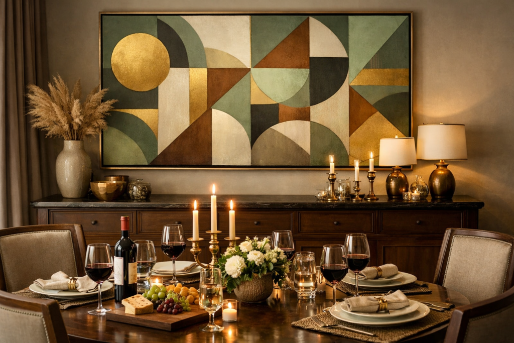
Warm earth tones—terracotta, warm browns, soft golds—create welcoming atmosphere that gently stimulates appetite without aggression. Geometric art featuring these colors in muted saturation levels promotes comfortable, relaxed dining pace. A geometric composition with burnt sienna circles on cream background or amber triangular forms suggests autumn harvest abundance, subconsciously encouraging guests to linger and enjoy meals.
Deep jewel tones—sapphire blue, emerald green, rich purple—add sophistication without appetite suppression when used thoughtfully. These colors work best in geometric compositions with substantial white or neutral space preventing overwhelming saturation. A geometric print featuring sapphire blue rectangles intersecting ivory background creates elegant atmosphere for formal dining without the cold sterility pure blues might introduce.
Avoid intense fire-engine reds or bright oranges in large-scale dining room art. While these colors stimulate appetite, they also increase heart rate and can create subtle anxiety that makes guests eat quickly rather than savoring meals. If using warm accents, choose brick reds, burnt oranges, or coral tones at lower saturation—colors suggesting warmth without urgency.
Soft greens and sage tones promote balanced, healthy eating atmosphere. Green’s associations with fresh vegetables and nature create subconscious „wholesome” feeling around dining. Geometric art featuring soft green circles, sage triangular forms, or olive-toned abstract patterns pairs beautifully with natural wood dining furniture while encouraging relaxed, mindful eating pace.
Monochromatic schemes—blacks, grays, whites—provide sophisticated backdrop that never competes with food presentation. Geometric line drawings in black on white background or grayscale geometric abstractions create gallery-quality atmosphere. The neutral palette ensures art remains interesting throughout meal without drawing attention from beautifully plated dishes that become dining table’s primary visual focus.
Warm earth tones and sage greens in geometric art create a welcoming dining atmosphere that gently stimulates appetite.
Formal vs Casual Dining Considerations
Formal dining rooms hosting occasional dinner parties require different geometric art than casual eat-in kitchens accommodating daily family meals.
Formal spaces benefit from sophisticated geometric compositions with refined color palettes—soft metallics, muted jewel tones, elegant monochromes. A large-scale geometric piece featuring gold leaf accents or subtle metallic inks creates occasion-appropriate sophistication. The art signals „special space” reserved for meaningful gatherings rather than rushed weeknight dinners.
Casual dining areas welcome more playful geometric expressions. Brighter colors, bolder compositions, and less precious presentations suit spaces doubling as homework stations and quick breakfast spots. Geometric prints featuring cheerful color combinations—teal and mustard, coral and gray—add personality without demanding reverence. The approachable art makes everyday dining feel pleasant rather than performative.
Breakfast nooks and kitchen dining areas need energizing morning-appropriate geometric art. Geometric compositions featuring yellow accents, sunny circular forms, or ascending triangular patterns complement morning’s natural light while providing gentle stimulation for groggy pre-coffee states. Avoid heavy, dark compositions that feel oppressive during breakfast hours.
Optimal Art Sizes and Placement
Dining room furniture configurations create specific artwork placement challenges requiring calculated approach to scale and positioning.
Above sideboards and buffets, art should span 50-75% of furniture width. Standard sideboard (60-72 inches wide) pairs well with 36-54 inch wide artwork. This proportion creates visual balance—art appears substantial enough to anchor furniture without overhanging edges awkwardly. Hang art 6-8 inches above sideboard top, creating breathing room while maintaining visual connection between furniture and wall art.
On walls without furniture, center large-scale geometric piece (40″x50″ or larger) at 57-60 inch height—standard gallery level that works whether guests stand during cocktails or sit during dinner. The consistent height ensures comfortable viewing from multiple positions throughout social gathering. In dining rooms with chair rails or wainscoting, position art center point 6-8 inches above millwork to create clean visual relationship with architectural details.
Avoid hanging art directly behind diners’ heads. While this wall seems obvious choice in rectangular dining rooms, artwork positioned here becomes invisible to seated diners while creating awkward backdrop for person occupying that seat. Choose wall perpendicular to table’s length—typically wall facing table’s side—so all diners enjoy view during meals. This placement makes art conversation piece everyone shares rather than backdrop only some guests see.
Multiple smaller pieces work better than single large work only when arranged as cohesive composition. Three medium geometric prints (16″x20″ or 18″x24″) hung horizontally in row spans similar width as single large piece while offering compositional variety. Maintain tight spacing (2-3 inches between frames) so grouping reads as unified statement rather than scattered collection. This works especially well in traditional dining rooms where single contemporary large-scale piece might feel jarring against ornate architectural details.
Consider ceiling height when selecting vertical versus horizontal orientations. Rooms with 8-foot ceilings benefit from horizontal geometric compositions that don’t draw eye to ceiling proximity. Spaces with 9+ foot ceilings can accommodate vertical pieces or square formats that utilize generous wall height. Vertical geometric compositions featuring ascending forms or stacked elements emphasize impressive ceiling height in formal dining rooms, similar to scale principles discussed in choosing proportionate art for walls.
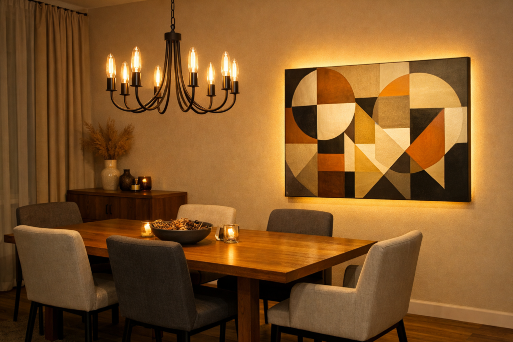
Dimmable accent lighting on a separate circuit allows geometric art to shine during dinner without competing with the chandelier.
Lighting Considerations for Art and Ambiance
Dining room lighting serves multiple purposes: illuminating food, creating mood, and showcasing artwork. Successful lighting schemes balance these competing needs.
Chandelier positioning affects artwork placement significantly. If chandelier hangs centered over dining table, avoid placing large art directly behind it—light fixture creates visual competition and shadows that prevent comfortable art viewing. Position artwork on wall perpendicular to chandelier’s axis where table lighting doesn’t interfere with wall art illumination.
Dimmable accent lighting for geometric art proves essential in dining rooms. Picture lights, track spots, or wall sconces illuminating artwork should operate on separate dimmer from dining table chandelier. This allows adjusting ambiance throughout meal—brighter lighting during cocktails when guests circulate and admire art, dimmer romantic lighting during dinner when attention focuses on food and conversation, art providing subtle background presence rather than demanding attention.
Warm-toned LED fixtures (2700-3000K) enhance geometric art while maintaining inviting dining atmosphere. Cool blue-white lighting (4000K+) makes spaces feel commercial or clinical—appropriate for art galleries but uncomfortable for dining. Warm illumination flatters both food presentation and geometric art, particularly pieces featuring warm color palettes or neutral backgrounds.
Avoid placing art where candlelight creates problematic glare. While candles enhance dining ambiance, their flickering light can create distracting reflections on glazed artwork. Position art where candle glow enhances rather than overwhelms—typically perpendicular to table rather than directly behind it. If geometric art sits on wall near candlelit table, specify matte finishes that minimize reflection.
Natural light exposure requires consideration if dining room has significant windows. Direct sunlight fades artwork over time, particularly prints and watercolors. If art hangs on wall receiving direct sun exposure for several hours daily, choose fade-resistant media—acrylic paintings, UV-protected prints, or archival pigment-based reproductions. Alternatively, use UV-filtering window treatments that protect art while maintaining room’s natural brightness during non-dining hours.
Coordinating Art with Dining Furniture
Geometric art should complement rather than compete with dining furniture’s style, material, and color.
Traditional wood dining sets pair beautifully with geometric art featuring warm neutral palettes. If dining table and chairs showcase rich mahogany, walnut, or cherry wood, choose geometric pieces with warm backgrounds—cream, beige, soft tan—and earth-toned geometric elements. The color harmony respects furniture’s traditional aesthetic while geometric forms add contemporary edge preventing room from feeling dated.
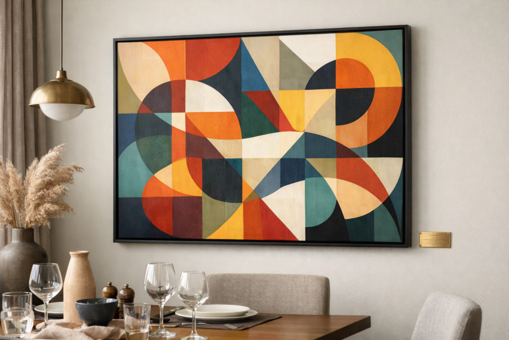
Modern minimalist dining furniture—glass tables, metal chairs, lacquered surfaces—supports bolder geometric art expressions. Clean-lined furniture creates perfect backdrop for dramatic geometric compositions featuring high contrast, bold colors, or complex patterns. A substantial black and white geometric print or vivid color-blocked abstract piece complements rather than conflicts with furniture’s contemporary simplicity.
Mixed-material furniture—wood table with upholstered chairs, for example—benefits from geometric art that bridges different textures. Choose pieces featuring both organic and geometric elements, or geometric compositions in colors echoing chair upholstery while maintaining visual connection to wood tones. This creates cohesive environment where art mediates between competing furniture styles and materials.
Match art frame materials to dining room’s dominant finishes. Rooms featuring prominent wood furniture gain cohesion when geometric art sits in natural wood frames—oak, walnut, or ash depending on furniture tones. Dining spaces with metal fixtures, chrome details, or industrial elements pair well with geometric art in thin metal frames—black, brass, or silver depending on room’s metal finish choices.
Geometric compositions with interesting color interactions become natural conversation starters without demanding sustained analytical attention.
Creating Conversation Without Controversy
Dining room art should spark interesting conversation without divisive reactions. Abstract geometric art navigates this challenge better than representational work.
Figurative art risks alienating guests with differing tastes or cultural perspectives. Religious imagery, political themes, or controversial subject matter can create uncomfortable dining atmospheres. Geometric abstraction avoids these pitfalls through universal visual language that different viewers interpret personally without imposing specific narratives.
Choose geometric compositions with enough visual interest to merit discussion but not so complex they demand sustained analytical attention. A geometric piece featuring interesting color interaction, surprising compositional balance, or intriguing negative space usage provides natural conversation starter. Guests can comment „I love how those blue circles overlap the yellow rectangle” without needing art history knowledge or fear of saying „wrong” interpretation.
Avoid geometric art so minimalist it appears accidental or so complex it feels exhausting. Single black square on white background—though aesthetically valid—offers little conversational purchase and may seem pretentious in dining context. Conversely, geometric composition with hundreds of tiny intersecting elements creates visual fatigue incompatible with relaxed dining. Sweet spot involves 5-15 distinct geometric elements in interesting relationships that reward attention without demanding it.
Consider including small descriptive cards near geometric art identifying artist, title, and year if hosting frequent dinner parties. This provides guests conversation starting point without making art feel museum-serious. Simple table card on nearby sideboard reading „Blue Circles, Sarah Johnson, 2023” legitimizes art discussion while maintaining casual approachability appropriate for home dining versus gallery viewing.
Seasonal and Holiday Flexibility
Dining rooms host seasonal gatherings requiring décor flexibility. Geometric art selections should accommodate rather than fight holiday decorating.
Neutral-palette geometric art provides year-round foundation that works with seasonal additions. A sophisticated black and white geometric print or grayscale abstract composition never competes with autumn centerpieces, winter holiday decorations, or spring floral arrangements. The permanent neutral art serves as backdrop while seasonal table settings provide color and thematic interest, similar to strategies in mixing different art styles cohesively.
Choose geometric compositions featuring colors that span multiple seasons. Geometric art with sage green, warm gray, and soft coral tones works equally well with autumn’s oranges, winter’s reds, spring’s pastels, and summer’s bright hues. The multi-seasonal palette prevents art from feeling seasonally inappropriate—crucial in room experiencing heavy decorative rotation throughout year.
Avoid geometric art whose colors strongly evoke single holiday. Geometric piece dominated by red and green geometric forms reads „Christmas” year-round, limiting dining room’s versatility. Similarly, orange and black geometric patterns feel perpetually Halloween-adjacent. If favoring seasonal colors, choose muted versions—dusty rose instead of valentine red, burnt orange rather than pumpkin orange—that transcend holiday associations.
Consider interchangeable art approach for dining rooms hosting frequent holiday gatherings. Invest in 2-3 geometric pieces with identical frame dimensions but different color palettes or compositional energies. Swap pieces seasonally—warmer palette for autumn/winter months, cooler tones for spring/summer. Uniform frame sizes (all 30″x40″, for example) allow easy rotation without repositioning hanging hardware.
Budget-Friendly Dining Room Art Solutions
Dining rooms need not require expensive art investments to achieve sophisticated aesthetic. Strategic choices deliver high-end appearance at accessible price points.
Print-on-demand geometric art offers affordable sophistication. Sites like Minted, Society6, and Printful feature independent artists’ geometric work available as high-quality prints starting $50-150 for dining-appropriate sizes (24″x30″ to 36″x48″). Search „minimal geometric dining room art,” „sophisticated abstract geometric,” or „modern geometric patterns” to find suitable styles. Specify matte finishes to avoid glare during candlelit dinners.
Frame upgrades transform affordable prints into investment-quality presentations. Purchase budget geometric print ($40-80), then invest in quality custom framing ($150-250). The combination costs less than single expensive original artwork while achieving comparable sophisticated appearance. Choose simple frames—thin black metal or natural wood profiles—that won’t feel dated as design trends evolve.
DIY geometric paintings suit dining rooms particularly well since pieces needn’t demonstrate advanced technical skill. Abstract geometric compositions forgive imperfect execution in ways representational painting cannot. Using quality stretched canvas, painter’s tape, and acrylic paints, create color-blocked geometric designs, overlapping circular forms, or intersecting linear patterns. Total cost stays under $100 while resulting in original artwork carrying personal significance.
Local art fairs and open studio events offer original geometric works at fraction of gallery prices. Emerging artists sell substantial pieces for $200-500—more than prints but far less than established artists’ gallery prices. The original artwork adds authenticity impossible with reproductions while supporting local creative community. Look specifically for geometric abstractionists during studio tour events.
Thrift stores occasionally yield vintage geometric prints from 1960s-70s at bargain prices ($15-40). These authentic period pieces, when properly reframed, provide character and conversation value exceeding contemporary mass-produced prints. Search consistently during weekly visits—quality pieces appear randomly but reliably for patient hunters willing to visit regularly.
Common Mistakes to Avoid
Certain errors repeatedly undermine dining room art selections. Awareness prevents these pitfalls.
Don’t hang art too high. This universal mistake proves particularly problematic in dining rooms where guests spend entire meals seated. Art centered at standing height (60 inches) can feel unreachably elevated when viewed from dining chairs. In dining-specific spaces, consider lowering center point to 54-56 inches, creating more intimate relationship between seated diners and wall art.
Avoid geometric art with food imagery or kitchen references. While this seems obviously wrong, surprisingly common mistake involves selecting abstract pieces incorporating fork silhouettes, plate shapes, or food-related colors obviously referencing dining function. These feel too literal, like hanging „KITCHEN” sign in kitchen. Let geometric abstraction remain purely formal—its presence in dining room provides sufficient contextual meaning.
Skip the matching sets mentality. Purchasing „dining room art set”—multiple identical pieces designed to hang together—creates coordinated appearance that feels mass-produced rather than curated. Instead, select single strong geometric statement piece or carefully choose complementary but not matching prints that create intentional collection feeling. Art should look accumulated over time, not purchased in single Target run.
Don’t position art where serving activities create viewing obstacles. If sideboard holds coffee service during dinner parties or bar setup during cocktail events, art hanging directly above becomes blocked by guests accessing these items. Choose wall location where art remains visible throughout various entertaining configurations. Consider traffic flow patterns when guests circulate, serve themselves, or gather for pre-dinner drinks.
Avoid geometric art whose scale seems apologetic. Tiny 8″x10″ prints hung in dining rooms designed for 12-person tables appear insignificant, telegraphing that art selection received minimal thought or budget. Dining rooms—spaces specifically designated for gathering and socializing—deserve artwork proportional to their social significance. If budget constrains purchasing substantial original pieces, invest in larger high-quality print rather than expensive small original that disappears on dining room walls.
Geometric abstract art succeeds in dining rooms by enhancing the space’s dual purpose: daily family gathering place and special occasion entertaining venue. Through thoughtful color selection promoting healthy appetite and conversation, strategic placement respecting furniture arrangements and social dynamics, and appropriate scale commanding attention without overwhelming, geometric art transforms dining spaces from purely functional rooms into designed environments where meals become memorable experiences. The artwork shouldn’t decorate your dining room—it should complete it, creating backdrop where both everyday dinners and special celebrations feel elevated by thoughtful, beautiful surroundings.
Frequently asked questions