-
Artfulinteriormagazine.com
-
Bauhaus Color Theory: Kandinsky’s Geometric Vision
Bauhaus Color Theory: Kandinsky’s Geometric Vision Explained
In 1923, Wassily Kandinsky distributed a simple questionnaire to his Bauhaus students. The question seemed straightforward: Which color belongs to which geometric shape? He offered three shapes—triangle, circle, square—and three colors—yellow, blue, red. Students overwhelmingly agreed: yellow triangles, blue circles, red squares. This wasn’t random. Kandinsky believed he’d discovered fundamental relationships between geometric forms and colors, a universal visual language rooted in spiritual and psychological truths.
This shape-color theory became central to Bauhaus teaching and profoundly influenced how we think about geometric abstraction today. When you see a red square and instinctively feel grounded, or a yellow triangle that seems sharp and energetic, you’re experiencing principles Kandinsky formalized a century ago. His vision—that geometric forms carry inherent emotional and spiritual meanings amplified by specific colors—transformed abstract art from arbitrary decoration into systematic visual communication.
Kandinsky’s Bauhaus years (1922-1933) produced some of geometric abstraction’s most influential theoretical writings and visually striking paintings. His synthesis of color theory, geometric form, and spiritual philosophy created a framework that designers, artists, and interior decorators still reference when choosing which geometric art belongs in which space.
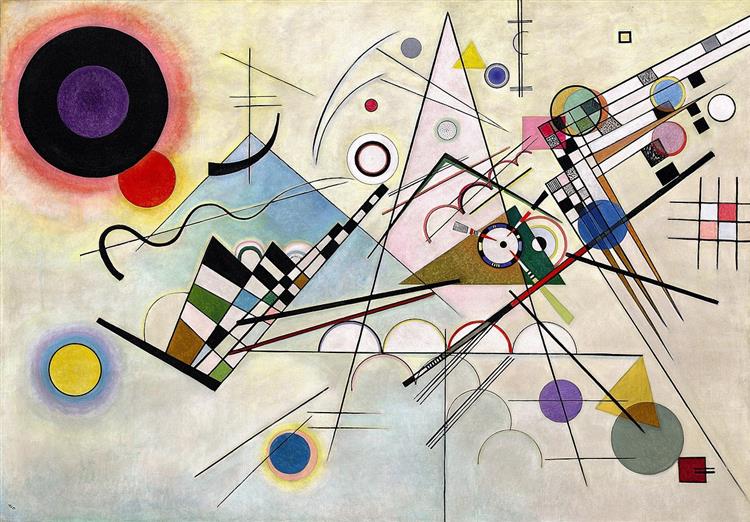
Wassily Kandinsky „Composition VIII” (1923) – geometric symphony of circles, triangles, and lines created at Bauhaus Weimar, demonstrating rational order and color theory principles (oil on canvas, 140 x 201 cm, Guggenheim Museum New York)
Kandinsky at the Bauhaus (1922-1933)
Wassily Kandinsky joined the Bauhaus in Weimar, Germany in 1922, already an established pioneer of abstract art. His 1911 treatise „Concerning the Spiritual in Art” had argued that painting could express spiritual truths through pure color and form, without depicting recognizable objects. The Bauhaus, with its mission to unite fine art and functional design, provided the perfect environment for developing these theories.
At the Bauhaus, Kandinsky taught color theory, analytical drawing, and the fundamentals of form. His courses explored how geometric shapes and colors interact psychologically and spiritually. Unlike traditional art academies focused on representational skill, Kandinsky’s teaching emphasized understanding abstract visual language—how circles, triangles, and squares communicate meaning independent of subject matter.
Kandinsky’s philosophy centered on „inner necessity”—the idea that true art emerges from spiritual imperatives rather than external observation. He believed geometric forms and colors possess inherent spiritual qualities. A circle isn’t just a shape; it represents infinity, spirituality, and the cosmos. Red isn’t merely a hue; it embodies warmth, power, and materiality. Combining specific shapes with specific colors creates precise spiritual-emotional communications.
The Bauhaus environment encouraged systematic experimentation. Kandinsky conducted exercises where students created compositions using limited geometric vocabularies, exploring how different arrangements affected emotional response. These studies laid groundwork for understanding geometric abstraction as rational, teachable discipline rather than mystical personal expression.
When the Nazis closed the Bauhaus in 1933, branding it „degenerate art,” Kandinsky fled to France. His Bauhaus legacy, however, endured. The color-form theories he developed influenced generations of designers, from mid-century modernists to contemporary minimalists. His systematic approach to geometric abstraction proved that spiritual art could also be methodical and teachable.
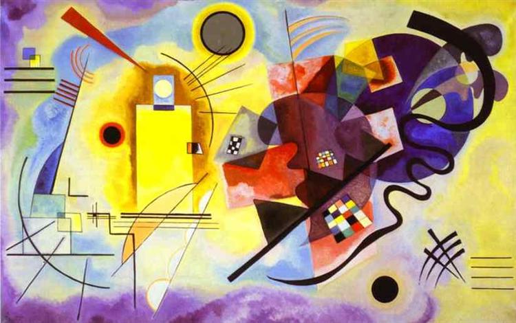
Wassily Kandinsky „Yellow-Red-Blue” (1925) – masterwork illustrating Bauhaus color-form correspondence theory with primary colors assigned to basic shapes: yellow rectangle, red cross, blue circle (oil on canvas, 200 x 127 cm, Centre Pompidou Paris)
Kandinsky’s Shape-Color Associations
Kandinsky’s famous triangle-circle-square questionnaire revealed surprising consensus. Approximately 75% of respondents matched yellow with triangle, blue with circle, and red with square. Kandinsky interpreted this as evidence of universal shape-color relationships rooted in human perception and psychology.
Yellow triangles embodied sharp, energetic, ascending movement. Yellow—the lightest primary color—naturally lifts upward, while triangles point directionally with aggressive geometry. The combination suggests intellectual energy, spiritual aspiration, and dynamic motion. Kandinsky associated yellow triangles with striving, ambition, and mental acuity.
Blue circles represented deep, cool, spiritual introspection. Blue—the darkest primary—recedes visually, creating depth and space. Circles, having no edges or direction, suggest infinity, eternity, and meditation. Blue circles evoke contemplation, spirituality, and inward focus. This combination appears frequently in Kandinsky’s paintings as spiritual anchors grounding more dynamic geometric elements.
Red squares conveyed powerful, balanced, grounded energy. Red—warm and advancing—demands attention while remaining stable. Squares, with their equal sides and right angles, represent stability, order, and earthly materiality. Red squares ground compositions, providing weight and solidity. Kandinsky saw this combination as representing physical matter and earthly existence.
The scientific basis for these associations remains debated. Some research suggests cross-modal correspondences—neurological connections between different sensory experiences—might explain why people consistently match certain colors with certain shapes. Others argue these associations are culturally learned rather than biologically inherent.
Kandinsky’s student surveys provided empirical data, but he also trusted intuition. He experienced synesthesia—neurological condition where senses blend—claiming to „hear” colors and „see” musical notes. This perceptual fusion convinced him that color-form relationships transcended arbitrary convention, reflecting deeper spiritual truths accessible through geometric abstraction.
The Spiritual Dimension of Geometric Abstraction
Kandinsky’s color theory was inseparable from spiritual philosophy. He believed geometric abstraction could express spiritual truths more directly than representational art. Rather than depicting religious subjects, geometric forms and colors could communicate spiritual concepts through pure visual means—what he called „painting as pure art.”
Synesthesia profoundly influenced Kandinsky’s approach. He genuinely experienced colors as sounds and shapes as musical compositions. A yellow triangle wasn’t just visually sharp; it sounded like a trumpet blast. Blue circles resonated like deep cello notes. This multisensory perception convinced him that abstract geometric art could achieve what he called „total art”—simultaneous engagement of multiple senses through purely visual means.
Theosophy—esoteric spiritual movement popular in early 20th-century artistic circles—heavily influenced Kandinsky’s thinking. Theosophical beliefs about spiritual evolution, cosmic harmony, and hidden universal truths aligned with his vision of geometric abstraction as spiritual language. He saw geometric forms as archetypal symbols carrying meanings across cultures and throughout history.
Inner necessity versus external reality became Kandinsky’s central philosophical distinction. Traditional art copied external appearances; abstract art expressed internal spiritual states. Geometric forms, liberated from representing physical objects, could communicate emotional and spiritual truths directly. A composition of circles, triangles, and squares wasn’t „about” anything except the spiritual-emotional relationships the geometric elements created.
This spiritual dimension distinguishes Kandinsky from purely formalist geometric abstractionists. While some artists pursued geometric precision for aesthetic or intellectual reasons, Kandinsky believed geometric abstraction served spiritual purposes. Every color choice, every geometric relationship, every compositional decision reflected spiritual intentions. Similar to how Mondrian used primary colors and grids to express spiritual harmony, Kandinsky employed triangles, circles, and squares as vehicles for transcendent communication.
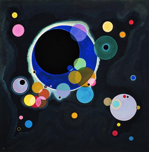
Wassily Kandinsky „Several Circles” (1926) – exploration of the circle as „fourth dimension” with overlapping transparent spheres on black background, representing spiritual harmony and cosmic unity (oil on canvas, 140.7 x 140.3 cm, Guggenheim Museum New York)
Bauhaus Color Theory vs Albers’ Interaction of Color
Josef Albers, Kandinsky’s Bauhaus colleague, developed dramatically different color theory. While Kandinsky believed colors possessed absolute inherent qualities, Albers demonstrated that color perception is entirely relative—colors change appearance based on surrounding colors. His famous „Homage to the Square” series proved the same color looks completely different depending on context.
Kandinsky’s approach was essentialist: yellow is inherently warm, sharp, ascending; blue is cool, deep, spiritual. These qualities exist independent of context. Albers’ approach was relativist: yellow appears warm next to blue but cool next to orange. No color possesses fixed qualities; everything depends on relationships.
Simultaneous contrast experiments formed the core of Albers’ teaching. Place a gray square on yellow background versus blue background, and the gray appears entirely different—cooler on yellow, warmer on blue. Albers built entire pedagogical method around demonstrating color’s relativity, directly contradicting Kandinsky’s absolute color-form associations.
Practical applications diverged significantly. Kandinsky’s theory suggests choosing geometric art based on desired emotional-spiritual effect: yellow triangles for energizing creative spaces, blue circles for meditation rooms, red squares for grounding living areas. Albers’ theory emphasizes considering how geometric art’s colors interact with surrounding wall colors, furniture, and lighting.
Both approaches remain influential. Interior designers using Kandinsky’s principles select geometric art matching room’s intended mood. Those following Albers consider how art’s colors will shift appearance in specific spatial contexts. Most sophisticated design synthesizes both theories—acknowledging colors’ contextual relativity while recognizing that certain color-form combinations create consistent psychological impacts.
Kandinsky’s Geometric Masterpieces
Composition VIII (1923), created shortly after joining the Bauhaus, represents Kandinsky’s geometric period’s pinnacle. The painting features intersecting circles, triangles, lines, and squares in black, white, and primary colors. Unlike his earlier explosive improvisations, Composition VIII demonstrates mathematical precision and geometric clarity. Each element occupies carefully calculated position, creating visual symphony of geometric relationships.
Yellow-Red-Blue (1925) explicitly explores primary color relationships through geometric forms. The canvas divides into three distinct areas, each dominated by one primary color expressed through characteristic geometric vocabulary. Yellow manifests through sharp triangles and pointed forms; blue appears in circles and curved elements; red anchors the composition through rectangular structures. The painting functions as visual thesis on color-form theory.
Several Circles (1926) presents variations on circular forms—Kandinsky’s most spiritually significant shape. Circles of different sizes, colors, and opacities overlap and float across dark background. The composition demonstrates how single geometric form creates infinite expressive possibilities through color, scale, and arrangement variations. This work embodies Kandinsky’s belief that geometric simplicity enables spiritual complexity.
Color Studies and watercolor experiments from Kandinsky’s Bauhaus years reveal his working process. These smaller works test color-form relationships before incorporating them into major paintings. The studies show systematic exploration—trying yellow triangles against different backgrounds, testing how blue circles interact with red squares, discovering which geometric arrangements create desired emotional effects.
These masterpieces established geometric abstraction as legitimate artistic pursuit equal to representational painting. Kandinsky proved that geometric forms and colors alone could create compositions as visually compelling and emotionally resonant as traditional subjects. His Bauhaus paintings remain icons of geometric art, demonstrating how systematic color theory enhances rather than restricts creative expression.
Applying Kandinsky’s Color Theory to Modern Interiors
Yellow geometric art energizes creative spaces according to Kandinsky’s principles. Studios, home offices, and workshops benefit from yellow triangles’ sharp, intellectual energy. The combination stimulates mental activity and creative thinking. Choose geometric prints featuring yellow triangular forms for spaces requiring focus, problem-solving, and innovative thinking.
Blue circles create contemplative atmospheres ideal for bedrooms and meditation rooms. The cool, spiritual quality of blue combined with circles’ infinite, centerless geometry promotes relaxation and introspection. Geometric art featuring predominantly blue circular forms helps establish calm, restful environments conducive to sleep and meditation, similar to how color psychology in geometric art affects mood.
Red squares ground living rooms and dining areas through their stable, material presence. The warmth of red combined with squares’ balanced geometry creates welcoming, grounded social spaces. Geometric compositions featuring red rectangular forms anchor seating areas, making rooms feel substantive and inviting without overwhelming.
Combining Kandinsky principles guides multi-room art selection. Rather than random geometric prints, choose pieces reflecting each space’s purpose. Creative rooms get yellow triangles; rest areas receive blue circles; social spaces feature red squares. This systematic approach creates homes where geometric art actively supports functional and emotional requirements.
DIY Kandinsky-inspired paintings offer accessible entry into color-form theory. Using acrylic paints and painter’s tape, create geometric compositions following Kandinsky’s associations. Paint yellow triangles ascending across canvas; arrange blue circles in meditative patterns; ground compositions with red squares. The process teaches color-form relationships while producing original geometric art aligned with Bauhaus principles.
Contemporary geometric art often unconsciously follows Kandinsky’s theories. When you instinctively feel that certain geometric prints belong in specific rooms, you’re likely responding to color-form relationships Kandinsky systematized. His century-old theory remains relevant because it captured genuine perceptual-psychological truths about how geometric shapes and colors communicate meaning.
Kandinsky’s Bauhaus color theory transformed geometric abstraction from arbitrary decoration into systematic visual language. His triangle-circle-square associations, spiritual philosophy, and color-form experiments created framework for understanding how geometric art communicates emotionally and spiritually. Whether you accept his theories literally or view them as useful guidelines, Kandinsky’s vision continues shaping how we select, create, and experience geometric art in contemporary spaces.
Frequently asked questions