-
Artfulinteriormagazine.com
-
Large Format Art for Small Spaces: Designer Guide
Large Format Art for Small Spaces: Designer Guide
Conventional wisdom says small rooms need small art. The logic seems obvious: limited square footage demands proportionally scaled decoration. But walk into a 200-square-foot studio apartment with a 48″x60″ abstract geometric painting dominating the main wall, and something surprising happens. The room doesn’t feel cramped—it feels intentional. The oversized art creates focal point so commanding that surrounding space organizes itself accordingly, making the room appear larger rather than smaller.
Interior designers have known this counterintuitive truth for decades: large-format art expands small spaces through psychological visual tricks. A substantial piece creates single strong focal point that prevents eye from measuring room’s actual dimensions. Multiple small pieces scattered across walls emphasize smallness by providing many reference points revealing limited space. One bold statement says „this room has purpose and confidence.” Scattered small pieces whisper „we’re trying to fill inadequate space.”
The key isn’t simply buying biggest affordable print. Success requires understanding which large-format compositions work in confined quarters, how to position them for maximum spatial impact, and which design mistakes transform space-expanding art into room-shrinking disaster. Done correctly, oversized geometric abstraction becomes small-space dweller’s most powerful design tool.
The Psychology of Scale in Small Spaces
Human perception measures space through reference points. In large rooms, we unconsciously compare furniture placement, window size, and architectural details to gauge dimensions. Small spaces lack these varied reference points, making rooms feel even smaller as eye quickly catalogs limited square footage.
Large-format art disrupts this measurement process. When substantial artwork commands attention, brain focuses on the piece itself rather than calculating room dimensions. The art becomes the space’s defining characteristic instead of its size limitations. A 12’x14′ bedroom isn’t „small”—it’s „the room with that stunning oversized geometric painting.”
Single focal point strategy prevents visual fragmentation. Multiple small art pieces create competing focal points, forcing eye to dart between them, constantly reassessing spatial relationships and becoming hyperaware of limited space. One large piece provides singular resting point, allowing comfortable visual anchor that makes room feel cohesive rather than cramped.
Negative space within large-format geometric art enhances this effect. Compositions featuring substantial unpainted areas—sparse line drawings, single bold shape on neutral background, minimalist geometric patterns—create breathing room within the art itself. The piece occupies significant wall area while internal emptiness prevents visual claustrophobia.
Color psychology amplifies spatial perception. Large-format art in cool colors (blues, soft greens, grays) recedes visually, creating depth illusion. The substantial size commands attention while cool palette suggests spatial expansion beyond the wall. Warm colors (reds, oranges, yellows) advance visually, which can work in small spaces when balanced with plenty of white or neutral surroundings to prevent overwhelming effect.
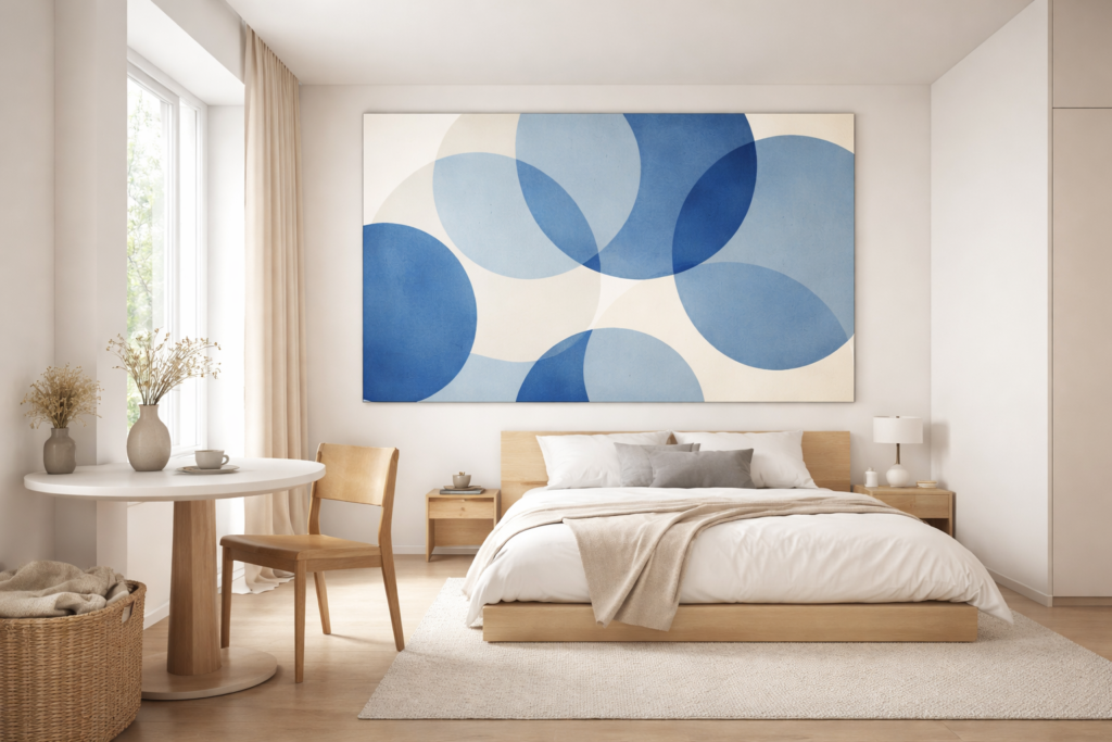
One oversized geometric piece creates a commanding focal point that prevents the eye from measuring the room’s actual dimensions.
Which Rooms Benefit Most
Studio apartments gain most dramatic transformation from large-format art. Without walls dividing space into distinct rooms, studios risk feeling like undifferentiated boxes. Oversized geometric piece above sleeping area or behind dining table creates visual zone definition that physical walls would provide in larger apartments. The art establishes territory, making 400 square feet feel like intentionally designed space rather than constrained compromise.
Small bedrooms paradoxically feel more spacious with large art above bed. The commanding piece draws eye to vertical wall space, emphasizing ceiling height rather than limited floor area. A 40″x50″ geometric print centered above queen bed in 10’x12′ room creates statement so bold that modest dimensions become irrelevant. The room is „cozy” rather than „small.”
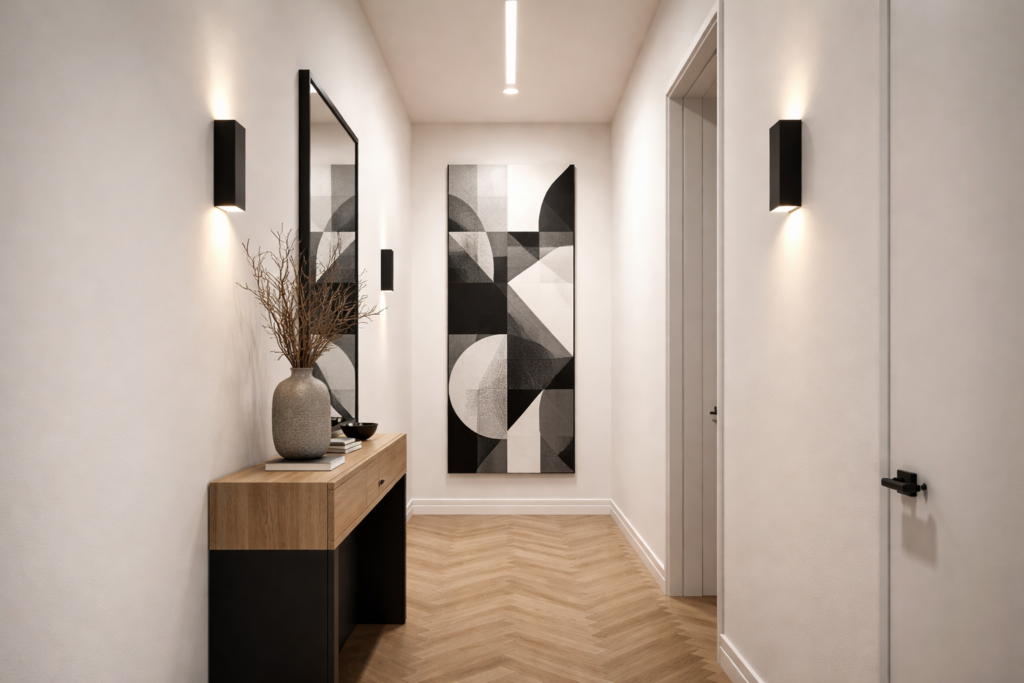
Narrow hallways benefit from large vertical pieces. A 30″x60″ geometric composition on narrow hallway’s end wall creates visual destination, making corridor feel like intentional gallery space rather than awkward passage. The vertical orientation emphasizes height, counteracting hallway’s squeezed horizontal dimensions.
Compact home offices and creative studios need large-format inspiration pieces. Small workspaces can feel oppressive during long focused hours. Bold oversized geometric art provides visual relief—something substantial to rest eyes upon during screen breaks. The art’s presence makes tiny office feel like legitimate creative space deserving respect and attention.
Optimal Dimensions for Different Wall Sizes
Calculating appropriate art size requires understanding wall dimensions and surrounding furniture relationships. The goal: artwork large enough to create impact but not so oversized it appears jammed into space.
Above sofas and beds, art should span 50-75% of furniture width. For standard queen bed (60″ wide), optimal art width ranges 30-45 inches. For compact loveseat (60″ wide), artwork spanning 36-48 inches wide creates proper visual weight. The piece appears substantial without overhanging furniture edges awkwardly, similar to principles discussed in choosing right art size for wall dimensions.
On empty walls, measure wall width and height, then aim for art occupying 50-60% of wall’s dimensions. For 8-foot-wide wall, 48-60 inch wide artwork fills space commandingly without edge-to-edge cramming. Leave at least 10-12 inches clearance between art edges and adjacent walls, doorways, or corners to prevent squeezed appearance.
Vertical spaces—walls flanking windows, narrow walls beside doors—suit tall narrow pieces. A 24″x48″ or 30″x60″ geometric print emphasizes ceiling height, particularly valuable in small rooms where vertical space is only expansive dimension. Stack two or three medium-sized geometric pieces vertically if single tall piece proves difficult to source, maintaining 3-4 inches spacing between pieces.
Gallery walls seem counterproductive in small spaces, but can work if executed as single large composition. Treat multiple pieces as components of one substantial artwork rather than scattered collection. Arrange 4-6 geometric prints in tight grid (2-3 inches spacing maximum) within defined boundary. The grouped arrangement reads as single large statement while offering compositional variety individual large piece can’t provide.
A tall vertical geometric composition on a hallway’s end wall transforms a narrow corridor into an intentional gallery space.
Color Strategies That Expand Space
Large-format art’s color palette dramatically affects spatial perception. Smart color choices make substantial artwork feel expansive rather than overwhelming in tight quarters.
Monochromatic palettes—variations of single color—create visual unity that expands perception. Black and white geometric print reads as sophisticated single entity rather than busy multi-element composition. The tonal consistency prevents color clashing with existing decor while substantial size commands attention. Shades-of-gray geometric abstractions provide similar unity with softer presence.
Light backgrounds within large-format pieces prevent visual weight. Geometric composition on white or cream background—even if featuring bold shapes—feels airier than edge-to-edge saturated color. The light negative space within art creates breathing room, making substantial size feel appropriate rather than oppressive. Choose geometric prints where background comprises at least 40-50% of composition.
Cool color dominance creates recession effect. Large geometric piece predominantly featuring blues, soft greens, or cool grays appears to recede into wall, creating depth illusion. The piece occupies significant square footage while suggesting spatial expansion beyond its physical boundaries. This works especially well in small rooms with limited natural light where cool tones combat potential darkness.
Accent warm colors strategically within cool compositions. Large geometric print with primarily blue or gray palette can feature small pops of warm coral, mustard, or terracotta without overwhelming. The warm accents provide visual interest and prevent coldness while cool dominance maintains spatial expansion effect. Aim for 70-80% cool tones, 20-30% warm accents.
Match art’s background to wall color for seamless integration. If walls are warm white, choose geometric art with warm white background. The color continuity makes art feel integrated into architecture rather than object placed on wall. The substantial size remains impactful while color harmony prevents visual interruption that emphasizes room’s boundaries.
Frame and Presentation Techniques
Framing decisions significantly impact how large-format art functions in small spaces. The wrong frame adds unnecessary visual weight; smart framing maintains artwork’s presence while avoiding bulk.
Thin frames (½ inch profile or less) in black metal provide crisp contemporary edges without mass. The narrow frame clearly defines artwork without adding significant width to overall piece. Black frames work particularly well with geometric abstraction’s clean lines, echoing the art’s precision without competing for attention. Avoid thick ornate frames that add 3-4 inches per side—on 40″x50″ piece, that’s 14 square inches of unnecessary bulk.
Floating frames create depth illusion valuable in small spaces. The artwork appears suspended between glass panels, adding subtle three-dimensionality. Light passes around piece’s edges, creating shadow play that suggests space behind art. This works especially well for geometric prints with substantial white space, where floating presentation emphasizes airiness.
Frameless stretched canvas on deep profile (1.5-2 inches) offers casual contemporary alternative. Large geometric painting on gallery-wrapped canvas with finished edges needs no frame, reducing visual weight while maintaining substantial presence. The three-dimensional canvas edge adds architectural quality, making piece feel more like wall installation than framed picture.
Light-colored frames in white, cream, or natural light wood expand rather than constrain. Dark frames create strong boundaries that emphasize artwork’s edges, calling attention to its size. Light frames blur transition between art and wall, making large piece feel more integrated. Natural ash or oak frames add warmth without heaviness, particularly appropriate for geometric art in Scandinavian or minimalist small spaces.
Skip matting for large-format pieces in small spaces. Matting adds 3-6 inches around artwork, increasing overall dimensions without enhancing the art itself. In small rooms, this extra bulk works against you. Large pieces command sufficient presence without matting’s amplification. If you prefer frame-to-art separation, choose frame with spacer that creates gap without additional outer dimension.
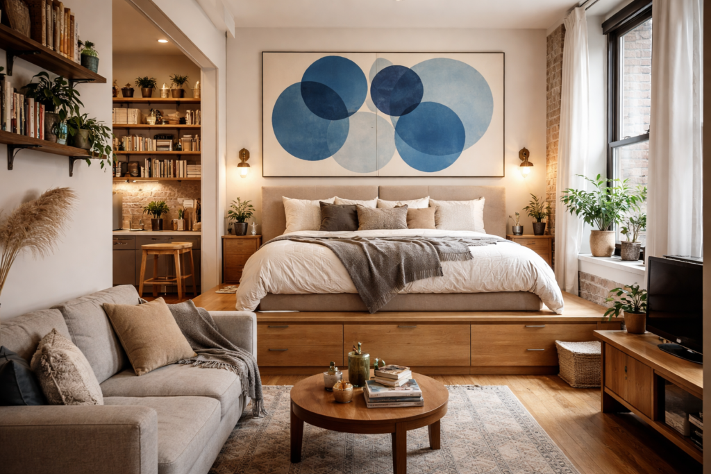
A 48″×60″ geometric painting above a platform bed creates a defined sleeping zone — the Manhattan small-space solution.
Strategic Placement Rules
Where you hang large-format art matters as much as the artwork itself. Proper placement maximizes spatial expansion while poor positioning wastes art’s potential.
Hang large art on room’s longest uninterrupted wall. This creates singular strong focal point that organizes entire space. In rectangular room, this typically means wall opposite entry door or wall behind primary seating. The artwork becomes room’s defining feature, immediately establishing visual hierarchy that prevents eye from cataloging space limitations.
Position at proper height—center of artwork at 57-60 inches from floor. This standard gallery height feels right to human eye regardless of room size. In small spaces with low furniture (platform bed, low-profile sofa), consider lowering to 54-56 inches to create more intimate relationship between furniture and wall art. Never hang so high that substantial gap appears between furniture top and art bottom—this disconnects pieces and emphasizes vertical distance.
Leave generous clearance around artwork—minimum 8-10 inches from corners, adjacent walls, doorways, and furniture edges. Large-format art needs breathing room to avoid appearing crammed. If piece nearly touches door frame or room corner, it telegraphs „we squeezed oversized art into undersized space.” Proper clearance communicates intentional, confident design choice.
Use single large piece rather than multiple medium pieces. Two 24″x30″ prints side-by-side occupy similar wall space as one 48″x30″ piece but create divided focal point. The single large work reads as bold statement; paired medium pieces read as compromise necessitated by space constraints. Exception: vertically stacked pieces on tall narrow wall, where arrangement emphasizes valuable ceiling height.
Create conversation groupings around large art. In studio apartment, position sofa and chairs facing wall with oversized geometric piece. The arrangement establishes living zone defined by artwork as anchor. In small bedroom, center bed precisely below large piece, creating symmetrical relationship that makes both elements feel intentionally designed rather than arbitrarily placed.
Lighting to Enhance Spatial Effect
Proper lighting amplifies large-format art’s space-expanding qualities. Poor lighting diminishes impact or creates problematic glare.
Natural light positioning requires thoughtful consideration. Hanging large art opposite bright window creates viewing challenges—piece often appears in shadow while glare from window makes comfortable viewing difficult. Position artwork on wall perpendicular to primary windows, allowing indirect natural light to illuminate without glare. This placement catches ambient light while avoiding harsh direct sunlight that fades art over time.
Accent lighting transforms large geometric art into room’s dramatic focal point after dark. Picture lights—small fixtures mounted directly above frame—create museum-quality illumination, though they add visual element to wall. Track lighting or adjustable ceiling spots provide similar illumination without frame-mounted hardware. Aim for warm-toned LED fixtures (2700-3000K) that enhance rather than wash out artwork’s colors.
Indirect lighting creates ambient glow highlighting art without harsh spotlight effect. Wall-mounted sconces flanking large piece (positioned 24-30 inches from art edges) cast gentle illumination across surface. Uplight positioned on floor below artwork bounces light upward, creating dramatic shadowing that emphasizes art’s three-dimensionality while illuminating wall behind, expanding spatial perception.
Avoid overhead-only lighting which creates uneven illumination with potential glare spots. Central ceiling fixture commonly produces hotspot on artwork’s upper section while lower portion remains relatively dim. Layer lighting—combining ambient overhead, accent spotlights, and decorative lamps—ensures even illumination across large-format piece throughout day and night.
Matte finishes prevent glare problems in small spaces where viewing distance is limited. Glossy finishes on large geometric prints create reflection problems when viewed from nearby seating. Request matte or anti-glare coatings on reproductions and photographs. If purchasing original paintings, note that heavy texture and matte acrylics reduce glare naturally compared to oil paintings’ inherent sheen.
What to Avoid: Common Mistakes
Large-format art in small spaces succeeds through confident execution. Hesitant compromises or common errors undermine art’s spatial benefits.
Don’t hang too high. Large artwork hovering near ceiling while furniture sits far below creates awkward disconnection that emphasizes vertical space in problematic way. High placement makes rooms feel like waiting rooms rather than designed spaces. Trust standard 57-60 inch center height, adjusted slightly lower if furniture sits particularly low.
Avoid busy, chaotic compositions in large format. Geometric art with dozens of competing elements, high contrast patterns, or saturated colors everywhere overwhelms in small spaces. Large-scale simple compositions—single bold shape, minimal line drawing, limited color palette—provide impact without visual assault. If composition feels frantic at 18″x24″, it’ll be unbearable at 40″x50″.
Don’t choose horizontal pieces for low-ceiling rooms. Horizontal orientation emphasizes width over height, calling attention to ceiling proximity. In rooms with 8-foot ceilings—common in apartments and older homes—vertical or square formats better utilize available wall space without emphasizing vertical limitations.
Skip the large-scale photo collages or busy gallery walls. These inherently involve multiple images creating visual fragmentation that works against small spaces. Single large-format geometric piece provides unified focal point; collages and busy groupings scatter attention, emphasizing that you’re working with limited square footage trying various space-filling tactics.
Never lean large art on floor against wall in tiny rooms. This casual styling works in spacious lofts where floor space is abundant. In small apartments, floor-leaning artwork consumes precious floor area, making room feel more cramped despite artwork’s aesthetic appeal. Hang large pieces properly or don’t use them at all, similar to considerations discussed in professional gallery wall layouts.
Avoid too-small furniture beneath large art. Delicate console table or tiny nightstand below substantial artwork creates proportion mismatch that emphasizes rather than resolves scale concerns. Furniture supporting large art should have sufficient visual weight—substantial bed frame, proper-sized sofa, appropriately scaled console—to anchor the piece rather than appearing dwarfed by it.
Budget-Conscious Large-Format Solutions
Large-format art typically costs more than smaller pieces, but smart strategies make oversized geometric abstraction accessible at various price points.
Print-on-demand services offer affordable large-scale geometric reproductions. Sites like Printful, Society6, and Redbubble allow independent artists to offer large-format prints (up to 40″x50″ or larger) at reasonable prices—often $80-200 for substantial sizes. Search „minimal geometric art,” „large abstract geometric,” or „oversized modern art” to find appropriate styles. Choose designs with generous white space to avoid overwhelming small rooms.
DIY large-scale paintings require minimal artistic skill when using painter’s tape and geometric compositions. Purchase 36″x48″ or 40″x50″ pre-stretched canvas ($40-80 at art supply stores), quality acrylic paints in 2-3 colors, painter’s tape, and foam rollers. Create simple geometric designs—color-blocked sections, overlapping circles, straight-line compositions. The handmade quality adds character impossible in mass-produced prints while cost remains under $150 for substantial original artwork.
Thrift stores and estate sales occasionally yield large vintage geometric prints at fraction of retail cost. Mid-century modern geometric pieces from 1960s-70s appear regularly at estate sales, often priced $20-75 for substantial works. The vintage quality and authentic period aesthetic add character. Reframe in simple contemporary frame to update appearance while preserving vintage art’s integrity.
Engineering prints provide ultra-affordable large-format solution. Upload high-resolution geometric design to printing service that produces architectural blueprints—these printers handle sizes up to 36″x100″ at remarkably low cost ($15-40 for very large sizes). The matte paper creates sophisticated appearance despite budget pricing. Mount on foam core for stability, frame in simple thin frame, and result rivals expensive gallery prints aesthetically.
Rental art programs allow rotating large-format pieces without purchase commitment. Services like Turning Art or local gallery rental programs let you display substantial artwork for monthly fees ($25-100 depending on piece value), with option to purchase if piece proves perfect. This suits renters uncertain about long-term space needs or those who appreciate variety over permanent collection building.
Real-World Small-Space Success Stories
Theory becomes concrete when examining actual small spaces transformed by large-format geometric art.
Manhattan studio (350 sq ft) used single 48″x60″ abstract geometric painting featuring soft blue circles on cream background to define sleeping zone. The oversized piece above platform bed created distinct bedroom area within open studio, while cool palette made space feel larger. Residents report room feels „like real apartment with separate bedroom” despite single-room reality.
London bedsit (280 sq ft) featured 40″x50″ black and white geometric line drawing above compact sofa. The dramatic piece transformed cramped space into „intentionally minimal design showcase.” Monochromatic palette prevented color conflicts with secondhand furniture, while substantial size made room feel curated rather than constrained.
San Francisco one-bedroom (550 sq ft) with narrow 6-foot-wide hallway hung 30″x60″ vertical geometric composition on hallway’s end wall. The piece transformed awkward passage into „gallery corridor,” making apartment feel more spacious by creating visual destination. Vertical orientation emphasized ceiling height, counteracting hallway’s squeezed width.
Small home office (8’x10′) installed 36″x48″ energetic geometric piece featuring yellow and gray triangular forms behind desk. Employee working from converted closet reported piece made space feel „like legitimate office deserving professional respect.” The artwork’s presence transformed marginal space into intentional design, improving both mood and productivity.
Large-format geometric art succeeds in small spaces by rejecting compromises that small-space dwellers typically accept. Instead of apologetically filling walls with scattered small pieces that emphasize limitations, oversized art makes bold statement: this space has confidence and intention. The counterintuitive strategy—go big rather than small—transforms constrained square footage into designed environments where limitations become defining characteristics rather than apologetic realities. When executed with proper scale, color, and placement considerations, that substantial geometric painting doesn’t crowd your small room—it completes it.
Frequently asked questions