-
Artfulinteriormagazine.com
-
How to Style Abstract Art in Scandinavian Interior
How to Style Abstract Art in Scandinavian Interior
Scandinavian interiors worship light, space, and intentional simplicity. White walls stretch uninterrupted, natural wood adds warmth without weight, and furniture sits low and minimal. Into this serene landscape, abstract geometric art doesn’t intrude—it completes. A single bold print above a low-profile sofa transforms emptiness into intentional negative space. Three small geometric pieces clustered near a window catch northern light, their shapes echoing the clean lines everywhere else.
The key isn’t adding art to Scandinavian design; it’s understanding that Nordic minimalism already thinks geometrically. The aesthetic’s obsession with function, proportion, and uncluttered surfaces creates natural affinity with geometric abstraction. Both celebrate essential forms stripped of decoration. Both trust that restraint communicates more powerfully than excess.
Styling abstract art in Scandinavian spaces requires different thinking than maximalist or eclectic interiors. You’re not filling walls or creating visual abundance. You’re placing singular focal points that honor surrounding simplicity while adding necessary visual interest. Done right, geometric art feels inevitable—as if removing it would create absence rather than relief.
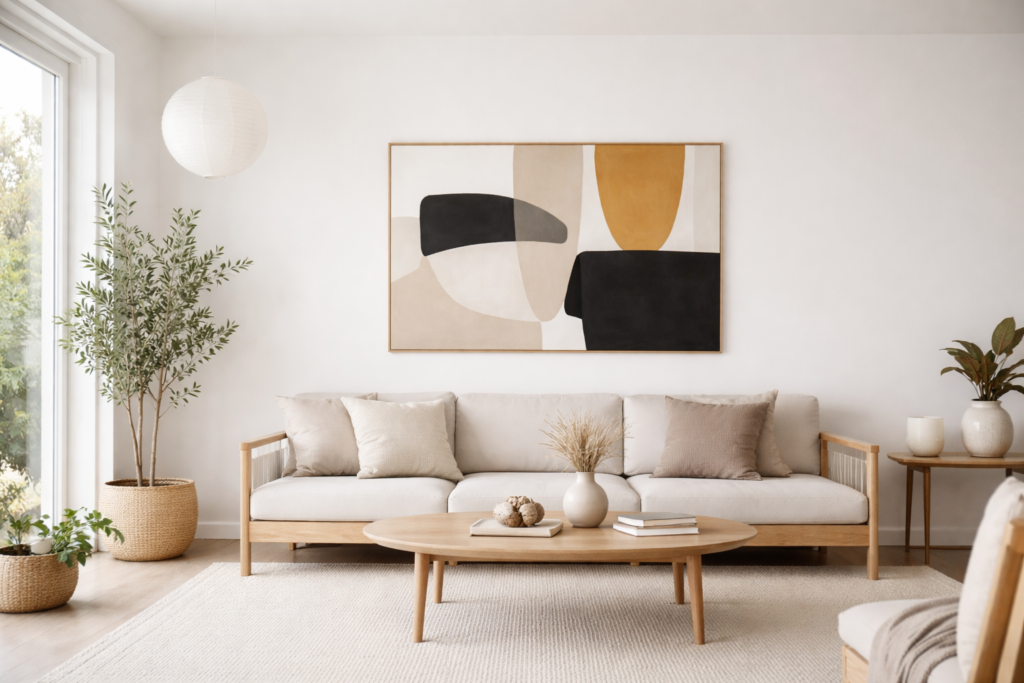
A single geometric statement piece above a low-profile sofa — the Scandinavian approach to art placement.
The Scandinavian-Abstract Art Connection
Scandinavian design emerged from climate and culture. Long dark winters demanded interiors that maximized precious daylight. Small urban apartments required space-expanding strategies. Democratic social values rejected ostentatious luxury in favor of accessible, functional beauty. The result: white walls reflecting light, multifunctional furniture, natural materials, and ruthless elimination of visual clutter.
Geometric abstract art shares these principles. Mid-century Scandinavian designers like Alvar Aalto and Arne Jacobsen created furniture with geometric clarity—bent plywood curves, molded plastic shells, tubular steel frames. Their aesthetic paralleled geometric abstract painters reducing forms to essential shapes. Both movements trusted that beauty emerges from functional honesty rather than applied decoration.
Hygge—Danish concept of cozy contentment—seems opposed to geometric abstraction’s intellectual rigor. But hygge isn’t cluttered maximalism; it’s intentional comfort within minimal frameworks. A single geometric print above a reading nook with sheepskin throw and candles creates hygge through focused coziness rather than visual chaos. The art provides contemplative focal point without overwhelming intimate scale.
Contemporary Scandinavian interiors increasingly incorporate art as necessary counterpoint to stark minimalism. Pure white rooms risk feeling sterile rather than serene. Geometric abstract art—especially in muted, nature-inspired colors—adds visual warmth without compromising clean aesthetic. The art becomes punctuation mark rather than run-on sentence.
Color Palettes That Work
Scandinavian color palettes derive from Nordic landscapes: soft grays of winter skies, warm beiges of birch bark, muted blues of coastal waters, sage greens of pine forests, charcoal blacks of long nights. Geometric art succeeding in these spaces echoes rather than fights this natural palette.
Monochromatic geometric prints—black line drawings on white backgrounds, gray gradient compositions—integrate seamlessly. They add visual interest through form and composition without introducing color conflict. A large-scale black and white geometric print above a white sofa creates dramatic focal point while maintaining tonal consistency. The shapes provide complexity; color stays simple.
Muted earth tones bridge geometric abstraction and Scandinavian warmth. Terracotta circles on cream background, sage green triangles intersecting gray rectangles, dusty blue geometric patterns—these colors reference clay, moss, stone, and sky without bright intensity. The organic color palette softens geometric precision, creating accessible rather than intimidating compositions.
Limited bright accents work strategically. Scandinavian interiors traditionally use single bold color—mustard yellow throw pillow, burnt orange chair—as punctuation against neutral backgrounds. Geometric art can fulfill this role. One vibrant abstract print with coral or teal geometric shapes becomes the room’s color statement, eliminating need for additional bright accessories.
Avoid overly saturated primaries unless intentionally creating 1960s retro Scandinavian aesthetic. Pure red-yellow-blue geometric prints reference Piet Mondrian and early modernism, which works in vintage-inspired spaces but clashes with contemporary hygge softness. If using primary colors, choose slightly desaturated versions—brick red rather than fire engine, mustard rather than lemon yellow.
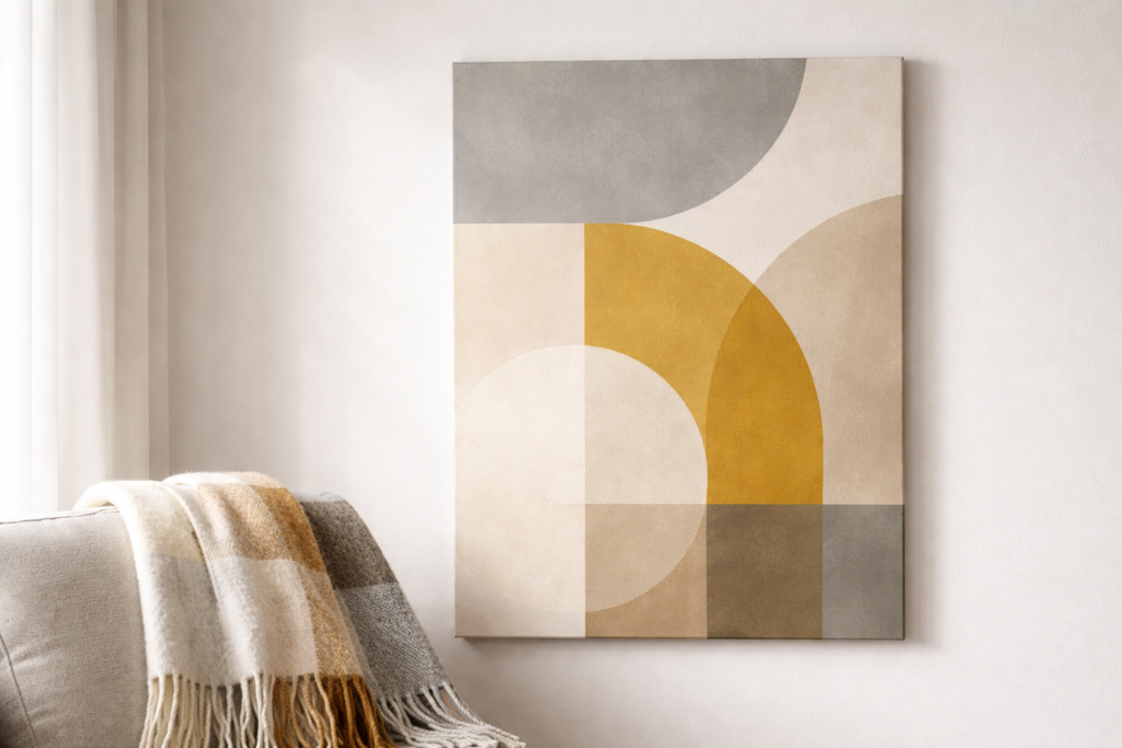
Muted Nordic color palette — soft grays and warm earth tones bridging geometric art with Scandinavian textiles
Scale and Placement Strategies
Scandinavian rooms favor negative space—the Japanese concept of ma, the meaningful pause between elements. Abstract art placement must respect this spatial breathing room. Hanging multiple small prints in tight grid fights the aesthetic; giving each piece generous surrounding space honors it.
Large-scale single statements work brilliantly. One substantial geometric print (36″x48″ or larger) above a sofa provides sufficient visual interest for entire wall. The scale prevents the piece from feeling insignificant against expansive white surfaces, while singularity maintains minimal philosophy. Choose geometric compositions with their own internal negative space—sparse line drawings, circles floating on solid backgrounds—so the art itself breathes.
Vertical orientations complement Scandinavian interiors’ clean lines. Tall narrow geometric prints (20″x40″) hung in pairs flanking a doorway or window emphasize ceiling height without horizontal sprawl. Vertical compositions featuring ascending triangles or stacked geometric elements reinforce upward visual movement, making rooms feel more spacious.
Gallery walls contradict Scandinavian principles unless executed with extreme restraint. If creating multi-piece arrangements, use identical frames (thin black or natural wood), consistent matting, and generous spacing—at least 4-6 inches between pieces. Limit arrangements to three or five pieces maximum, and maintain strict grid alignment. The goal is cohesive composition, not eclectic abundance.
Unexpected placement creates interesting focal points. Lean large unframed geometric print on mantel or low console rather than hanging it. The casual placement feels approachable rather than precious, and allows easy rotation. Prop smaller geometric pieces on floating shelves among minimal objects—a single sculptural vase, small plant, one book. The art integrates into curated vignettes rather than demanding isolated attention.
Frame and Presentation Choices
Framing decisions dramatically affect how geometric art reads in Scandinavian spaces. Ornate frames—gilded, carved, heavily detailed—immediately contradict minimal aesthetic. Clean, simple frames that disappear behind art work best.
Thin black metal frames provide crisp contemporary edge. The narrow profile (½ inch or less) creates sharp boundary without visual weight. Black frames pop subtly against white walls, giving geometric prints defined presence without competing for attention. This works especially well for line-based geometric art where frame echoes the art’s own linear quality.
Natural wood frames—oak, ash, birch in light finishes—warm geometric abstraction while maintaining Scandinavian material palette. Choose simple profiles without decorative details. The wood grain should be visible but subtle, providing organic texture that balances geometric precision. Light wood frames work beautifully with earth-toned geometric prints, creating cohesive natural aesthetic.
Floating frames—where art appears suspended between two panes of glass or acrylic—suit geometric prints with their own negative space. A simple line drawing or sparse geometric composition in floating frame becomes sculptural object rather than flat picture. The transparency references Scandinavian values of lightness and spatial openness.
Unframed stretched canvas offers casual contemporary alternative. Geometric paintings on deep-profile canvas (1.5-2 inches) can hang frameless if edges are cleanly finished. This works for bold geometric compositions where frame might feel unnecessarily formal. The three-dimensional canvas edge adds subtle sculptural quality absent from framed prints.
White or off-white matting creates breathing room between geometric art and frame, amplifying the print’s presence without additional color. Wide mats (3-4 inches) around smaller geometric pieces (8″x10″ or 11″x14″) give them substantial presence despite modest size. The white mat echoes white walls, making frame and art feel integrated into architecture rather than added afterward.
Styling by Room Function
Living rooms anchor Scandinavian homes as gathering spaces emphasizing conversation and comfort. Geometric art here should create contemplative focal point without demanding constant attention. Large-scale abstract composition above main sofa—featuring soft geometric forms in muted palette—provides visual interest for guests while remaining peaceful enough for daily living. Avoid busy, high-contrast geometric patterns that create visual tension incompatible with hygge coziness.
Bedrooms require especially calm geometric selections. Soft circular forms, gentle color gradients, horizontal linear compositions promote restful atmosphere. Hang geometric art directly above bed at lowered height (4-6 inches above headboard rather than standard 8-10 inches) to create intimate relationship between art and sleep space. Monochromatic geometric prints in grays and whites maintain serene environment conducive to sleep.
Home offices and workspaces can handle more energetic geometric abstraction. Dynamic compositions featuring intersecting lines, bold angles, contrasting shapes stimulate focus and creativity without overwhelming. Here, brighter color accents—teal, coral, mustard yellow—work within geometric prints to add energizing visual punctuation. Position art at eye level when seated at desk for optimal viewing during work hours, similar to principles discussed in choosing appropriate art scale for wall spaces.
Dining areas benefit from geometric art that sparks conversation without competing with food presentation. Medium-scale prints (24″x30″) featuring interesting but not overwhelming geometric patterns work well on walls adjacent to dining tables. Avoid intense reds or oranges in geometric art near eating spaces—these colors can unconsciously affect appetite and digestion. Stick with cooler blues, greens, or neutral geometric compositions.
Entryways and hallways are opportunity for bold geometric statements since viewers encounter them briefly. A striking large-scale geometric print in narrow hallway creates dramatic moment without overwhelming since you pass through quickly. Vertical geometric compositions work especially well in narrow entry halls, emphasizing height and directing eye upward.
Lighting Considerations
Scandinavian design obsesses over light—natural and artificial—because Nordic countries endure long dark winters. How geometric art interacts with available light determines its success in these spaces.
Maximize natural light reflection by positioning geometric art on walls perpendicular to windows rather than opposite them. Art opposite windows often appears in shadow during bright daylight. Perpendicular placement catches indirect natural light while avoiding glare. Geometric prints with white or light backgrounds particularly benefit, as they bounce light rather than absorbing it.
Matte finishes on geometric prints prevent glare in high-natural-light environments. Glossy finishes create hotspots that make viewing art difficult during bright conditions. If using photographs or reproductions of geometric paintings, specify matte or anti-glare coatings. This maintains visibility throughout changing daylight conditions.
Layered artificial lighting—combining ambient, task, and accent lighting—follows Scandinavian lighting philosophy. Consider subtle picture lights or track lighting to highlight geometric art during evening hours. Warm-toned LED fixtures (2700-3000K) maintain cozy hygge atmosphere while ensuring art remains visible after dark. Avoid cool blue-toned lighting (4000K+) which makes spaces feel clinical rather than comfortable.
Candles—integral to hygge—should enhance rather than compete with geometric art. Position candles on surfaces below and slightly offset from wall-hung art so flickering light creates gentle animation without direct glare on glass or canvas. The organic movement of candlelight provides interesting contrast to geometric art’s static precision.
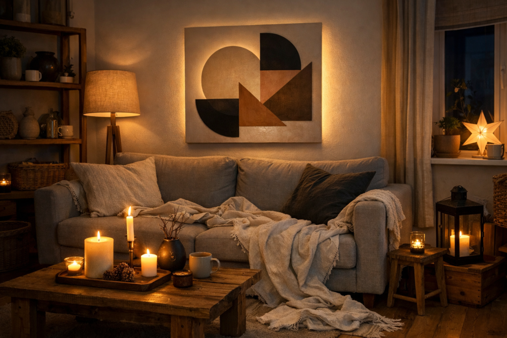
Candlelight and subtle picture lighting animate geometric art during Nordic winter evenings — hygge through form.
Mixing Geometric Art with Scandinavian Textiles
Scandinavian textile tradition—thick wool throws, sheepskin rugs, linen curtains—adds crucial tactile warmth to minimal spaces. Geometric art should coordinate with rather than ignore these soft textural elements.
Color coordination between geometric art and textiles creates cohesive rooms without obvious matching. If geometric print features muted blue circles, echo that blue in throw pillow or blanket without exact color matching. The visual connection feels intentional but not contrived. Geometric patterns in art can inspire complementary patterns in textiles—if art has linear composition, choose textiles with subtle stripe or grid weaving.
Contrast geometric art’s visual precision with textile softness. Pair sharp angular geometric prints with plush, organic textures—chunky knit throws, nubby linen cushions, natural sheepskin. The juxtaposition prevents spaces from feeling too rigid or overly controlled. Geometric art provides intellectual visual interest; textiles provide physical comfort.
Scandinavian textile patterns—traditional Folk motifs, modern Marimekko prints—can coexist with geometric abstract art if carefully balanced. Both shouldn’t feature equally bold patterns. If using graphic Marimekko fabrics, choose quieter monochromatic geometric art. If geometric art is primary visual statement, keep textiles solid or very subtly patterned.
Natural fiber textiles—linen, wool, cotton—share geometric art’s emphasis on honest materials. A geometric print’s clean forms feel more integrated in rooms featuring natural textile textures rather than synthetic fabrics. The material consistency reinforces Scandinavian values of authenticity and sustainability.
Budget-Friendly Sources and DIY Options
Authentic Scandinavian design emphasizes accessibility—beautiful functional objects available to everyone, not just wealthy collectors. This democratic philosophy extends to styling geometric art affordably.
Print-on-demand services (Printful, Society6, Redbubble) offer affordable geometric abstract art from independent artists. Search specifically for „minimal geometric art,” „Scandinavian abstract,” or „muted geometric prints” to find appropriate styles. Standard sizes (16″x20″, 18″x24″) keep costs reasonable while providing sufficient scale for Scandinavian spaces. Choose prints with generous white or neutral space rather than edge-to-edge pattern.
IKEA’s Björksta and Pjätteryd series include geometric abstract options compatible with Scandinavian aesthetic at entry-level prices. While mass-produced, these prints work well in rentals or first homes where budget constraints matter. Pair them with higher-quality frames from independent frame shops to elevate overall presentation.
DIY geometric paintings require minimal artistic skill when using painter’s tape and acrylic paint. Create simple compositions—overlapping circles, intersecting lines, blocked color fields—on stretched canvas. The handmade quality feels authentic to Scandinavian craft tradition. Stick with 2-3 colors maximum and leave substantial unpainted canvas to maintain minimal aesthetic, similar to techniques explored in understanding geometric shapes in interior psychology.
Thrift stores and estate sales occasionally yield mid-century modern geometric prints original to Scandinavian design’s golden era (1950s-1970s). These authentic vintage pieces add character impossible to replicate with contemporary reproductions. Look for Swedish, Danish, or Finnish artists’ signatures, and research values before purchasing significant pieces.
Digital art frames (Meural, Netgear Meural Canvas) allow rotating geometric art collections without physical storage issues. Load curated selection of geometric abstract images—mixing personal favorites, public domain works, and purchased digital files—and program rotation schedule. This suits Scandinavian minimalism’s preference for flexibility and avoidance of permanent visual commitments.
Common Mistakes to Avoid
Overcrowding walls contradicts Scandinavian minimalism’s core principle. If questioning whether wall needs more art, the answer is usually no. Scandinavian design trusts emptiness as positive design element. That expanse of white wall isn’t waiting to be filled—it’s providing visual rest that makes your carefully chosen geometric pieces more impactful.
Matching art too literally to accessories creates overly coordinated rooms lacking personality. If geometric print has yellow triangle, you don’t need yellow throw pillows and yellow vase. Trust that subtle color echoes create sufficient cohesion. Scandinavian interiors look collected over time, not decorated in single shopping trip.
Ignoring art-to-furniture scale creates awkward proportions. Tiny geometric print above large sofa looks insignificant; oversized piece above delicate console table overwhelms. General rule: art width should be 50-75% of furniture width below it. In Scandinavian spaces where furniture tends minimal and low-profile, err toward larger art scale to prevent pieces from disappearing against expansive walls.
Hanging art too high remains universal mistake, but particularly noticeable in Scandinavian interiors where low furniture and clean walls make sight lines obvious. Standard rule—center of art at 57-60 inches from floor—works for gallery spaces but often feels too high in homes. In spaces with low-slung Scandinavian furniture, consider lowering art to 54-56 inches, creating more intimate relationship between furniture and wall art.
Neglecting negative space around art diminishes its impact. Leave generous clearance—at least 6-8 inches—between geometric prints and adjacent furniture, doorways, or other wall elements. This breathing room allows art to exist as distinct focal point rather than cramped afterthought. Scandinavian design philosophy insists each element needs space to be fully appreciated.
Styling abstract geometric art in Scandinavian interiors succeeds when respecting both aesthetics’ shared values: intentional simplicity, honest materials, functional beauty, and trust in essential forms. The art shouldn’t decorate these spaces but complete them—providing necessary visual interest while honoring the serene minimalism that makes Scandinavian design timelessly appealing. Choose pieces thoughtfully, hang them generously, and resist urge to add more. In Nordic homes, less truly is more, and geometric abstraction proves that essential forms communicate powerfully without excess.
Frequently asked questions